- If you want a checklist launcher to be smaller on mobile, or
- If you have different UI/CSS for your desktop version versus your mobile version.
Recognizing if a user is on mobile
To be able to cater content specifically for mobile, you first need to have Usertour.js pass an attribute calleddevice_type, which can be configured like below:
Smaller checklist launchers for mobile
Even though Usertour content is responsive, the checklist launchers might still appear too large. If you want to make them smaller for mobile, you don’t have to create new checklists on a separate theme. Instead, you can use Usertour’s powerful conditional theme variations.- Step 1: Go to themes and select your main theme.
- Step 2: Add a conditional variation using the device type user attribute.\
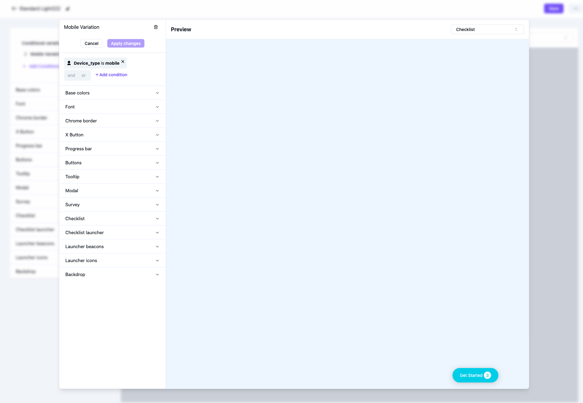
- Step 3: Change the size of the checklist in the variation and save the theme. Now Usertour will automatically apply this variation when the user attribute device type is mobile.
Separate flows based on device type
If your UI is significantly different between desktop and mobile, you can create two separate flows/checklists for desktop versus mobile and adjust the steps in each flow/checklist to match the given UI. See the steps below.-
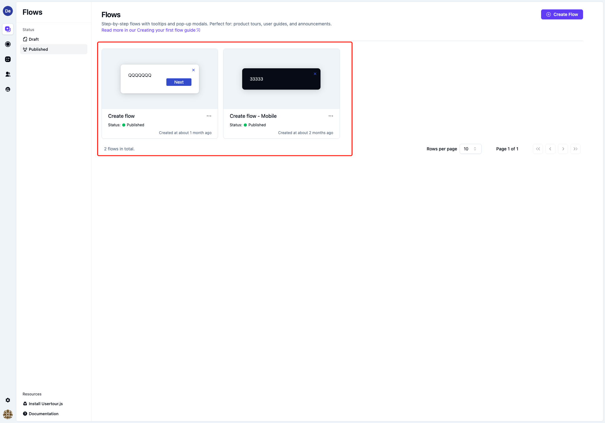
Step 1: Create two separate flows/checklists, one for mobile and one for desktop\
-
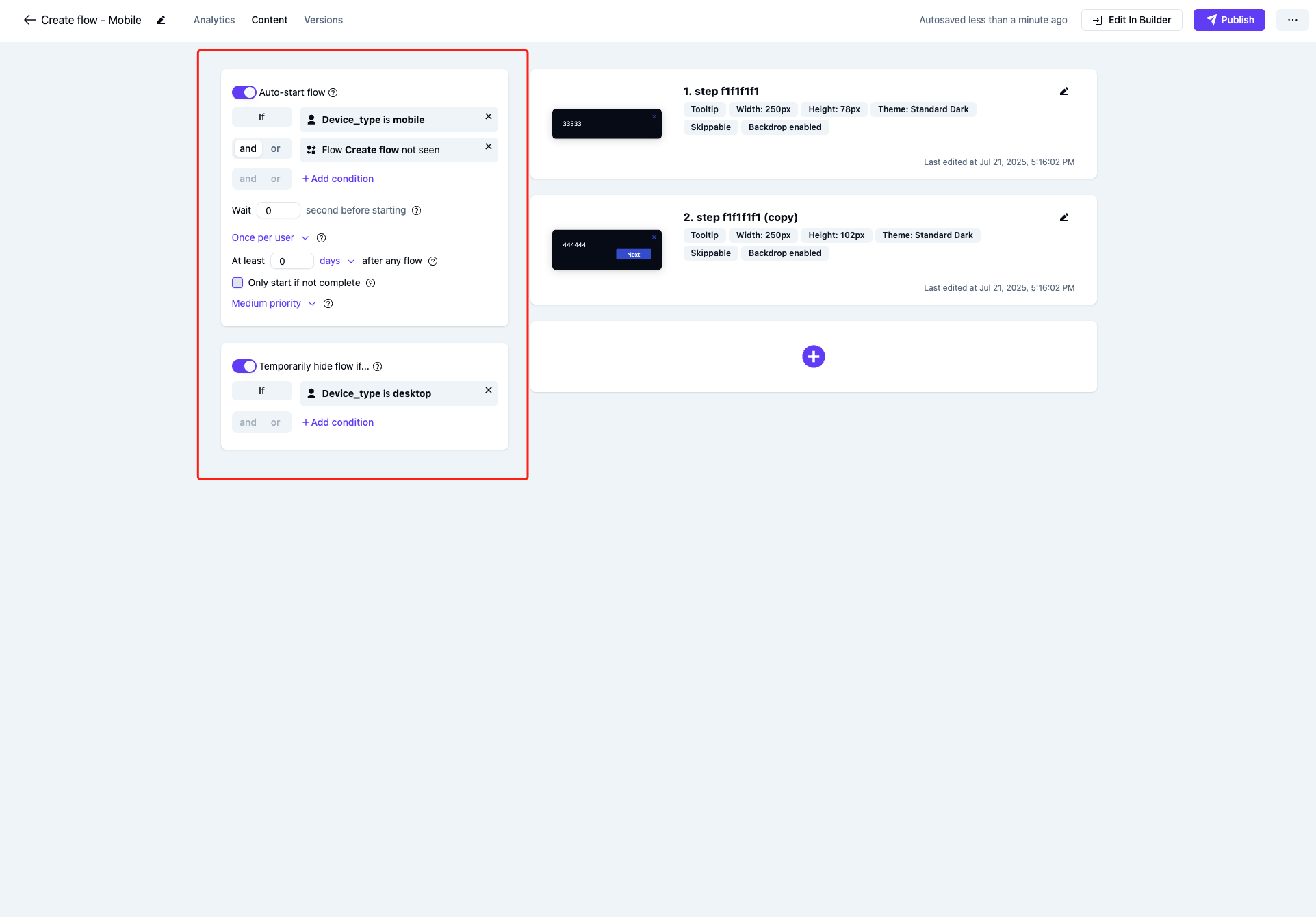
Step 2: Set each flow/checklist to only start when on the given device type using the user attribute and to be hidden when not on this device type.\
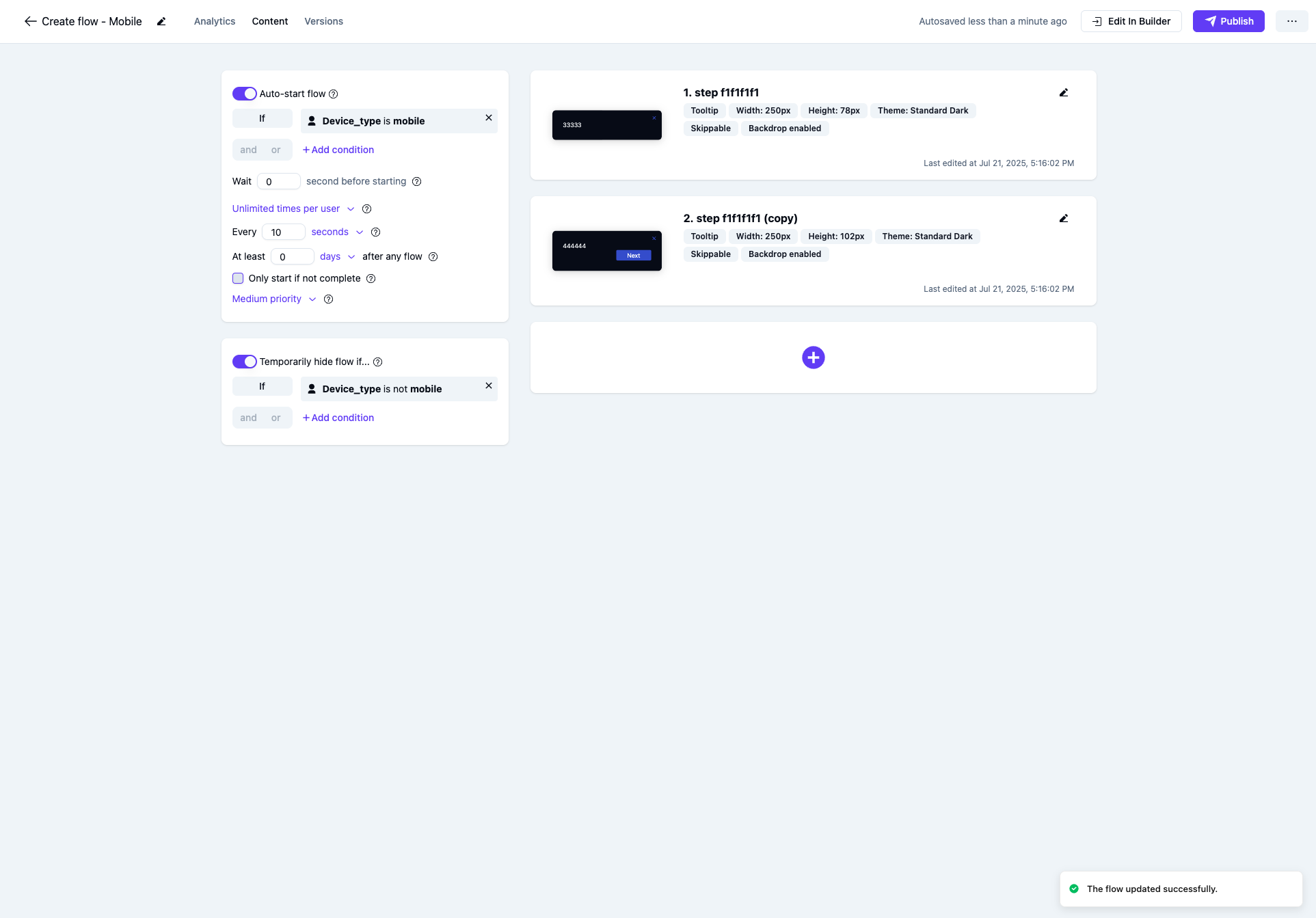
-
Step 3: To avoid the duplicate flow starting twice (once for mobile and once for desktop), you can furthermore add a condition to only start the duplicate flow in case the other flow has not been seen.\