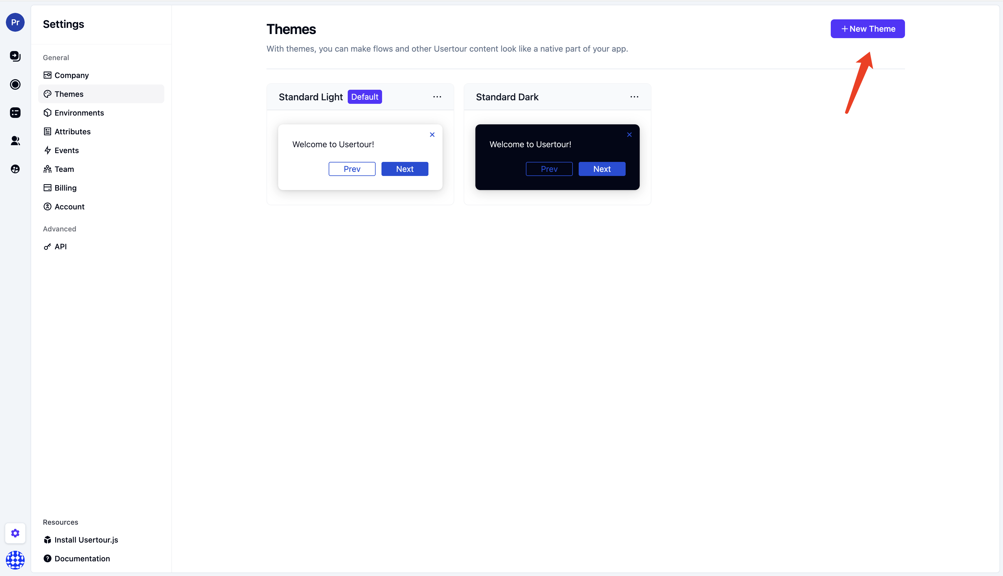
Creating a theme
To modify or create a new theme, follow these steps:- Select Settings > Themes from the sidebar
- Click New Theme or select an existing standard theme
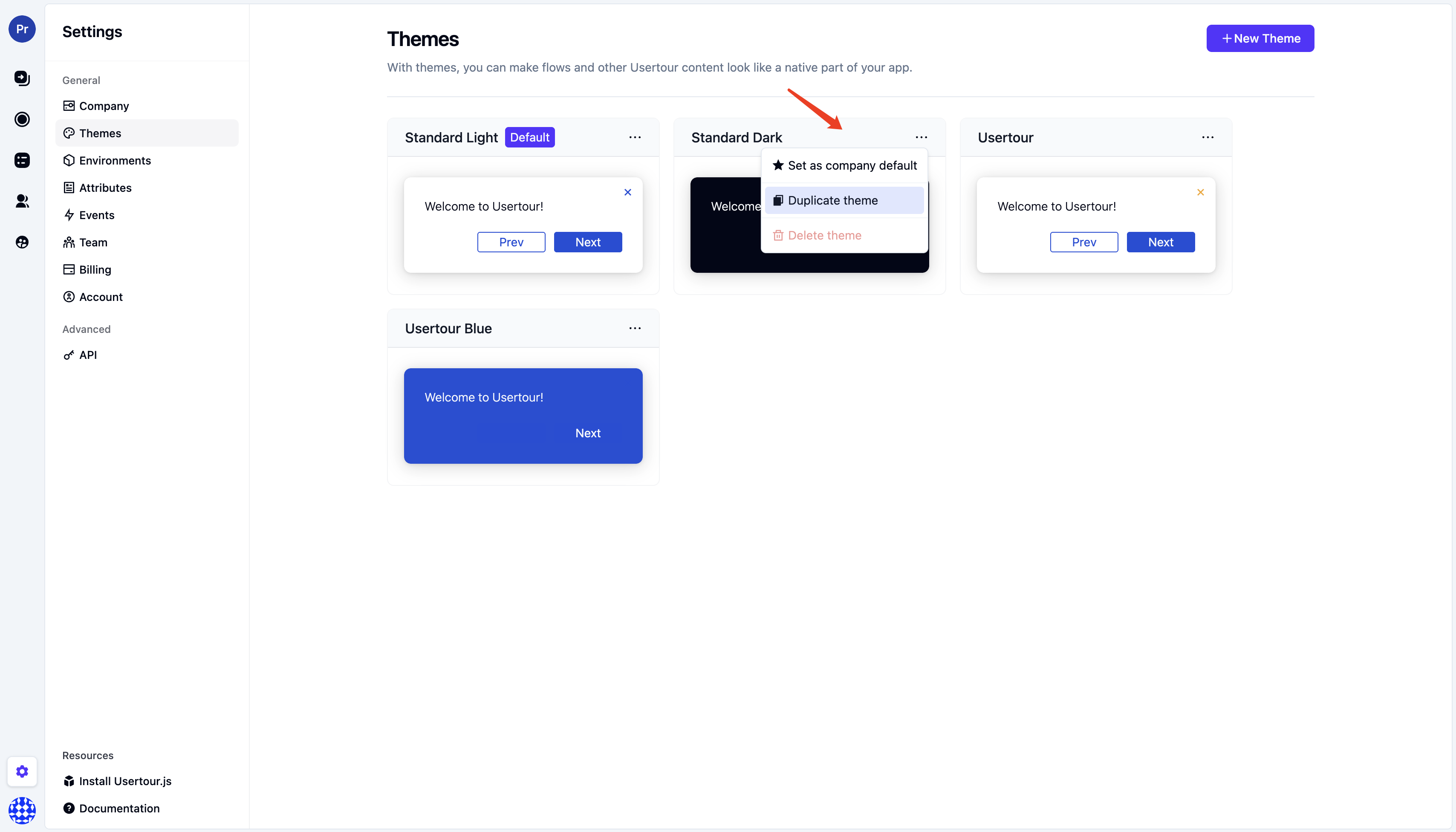
- To edit an existing standard theme, click the three dots in the top-right corner of each theme card, then click Duplicate theme to customize
Designing your first theme
We recommend starting by adjusting these options:Base colors
Choose your Brand Background Color and Main Text Color. All other elements and hover/active states will automatically match.Font
Select your app’s font. We support all standard fonts and Google fonts out of the box. For other fonts, please contact us. In the preview area, you can see a live example of what your theme looks like.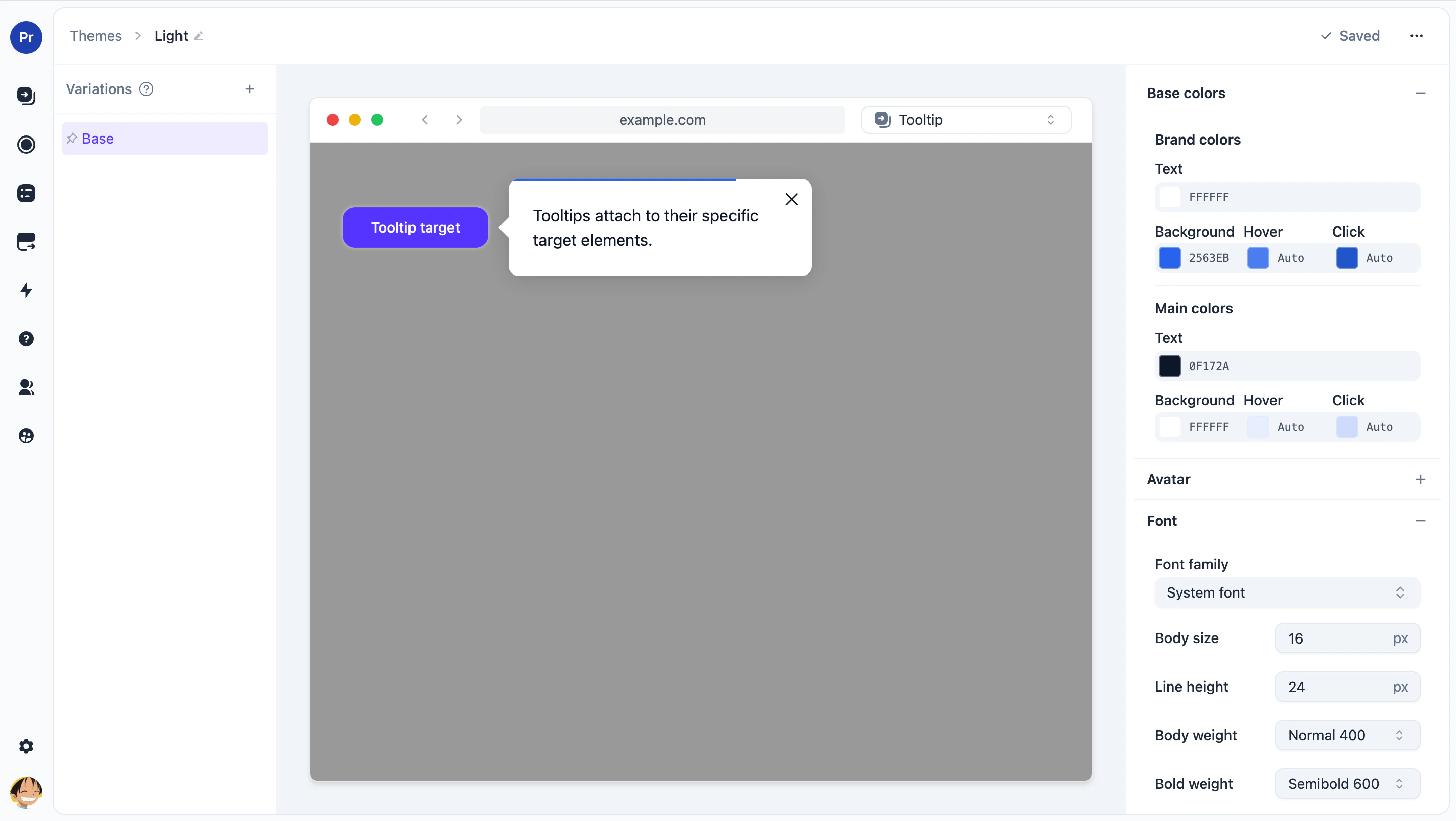
Other elements you can modify
- Font sizes
- Button size, position, and colors
- Tooltip size, position, and colors
- Checklist size, position, and colors
Conditional variations
You can create conditional overrides of your theme based on user (and company) attributes and URLs (via current page conditions). Use cases include: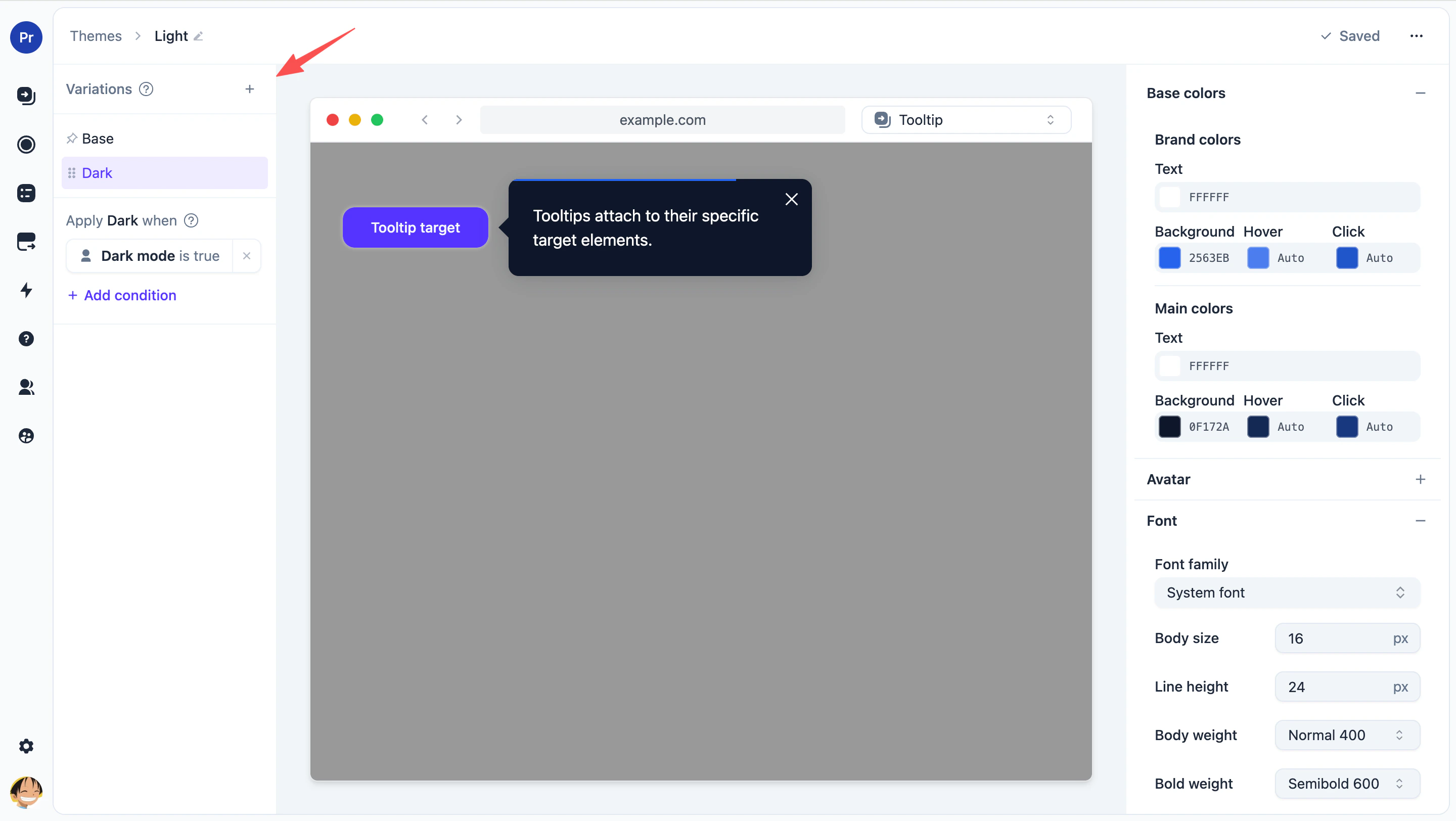
Supporting dark and light modes
Support both dark and light modes in a single theme. This requires your UserTour.js snippet to pass a user attribute indicating whether the user is in dark or light mode.Mobile responsiveness
Adjust sizing for mobile devices.Conditional color changes
Change the color of content based on company or user attributes, or the URL the user is currently on. For example, to handle white-labeled versions of your software with different color schemes.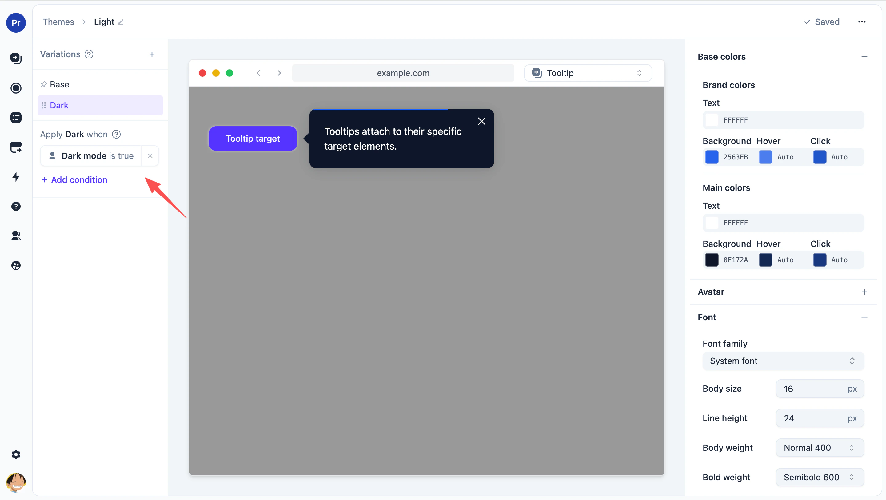
Setting a default theme
You can set a new theme as your default theme, which means it will be used by default for all new content. You can change the theme on specific flows, checklists, and launchers. Click the three dots menu in the top-right corner of the theme card to promote a theme to be the default theme.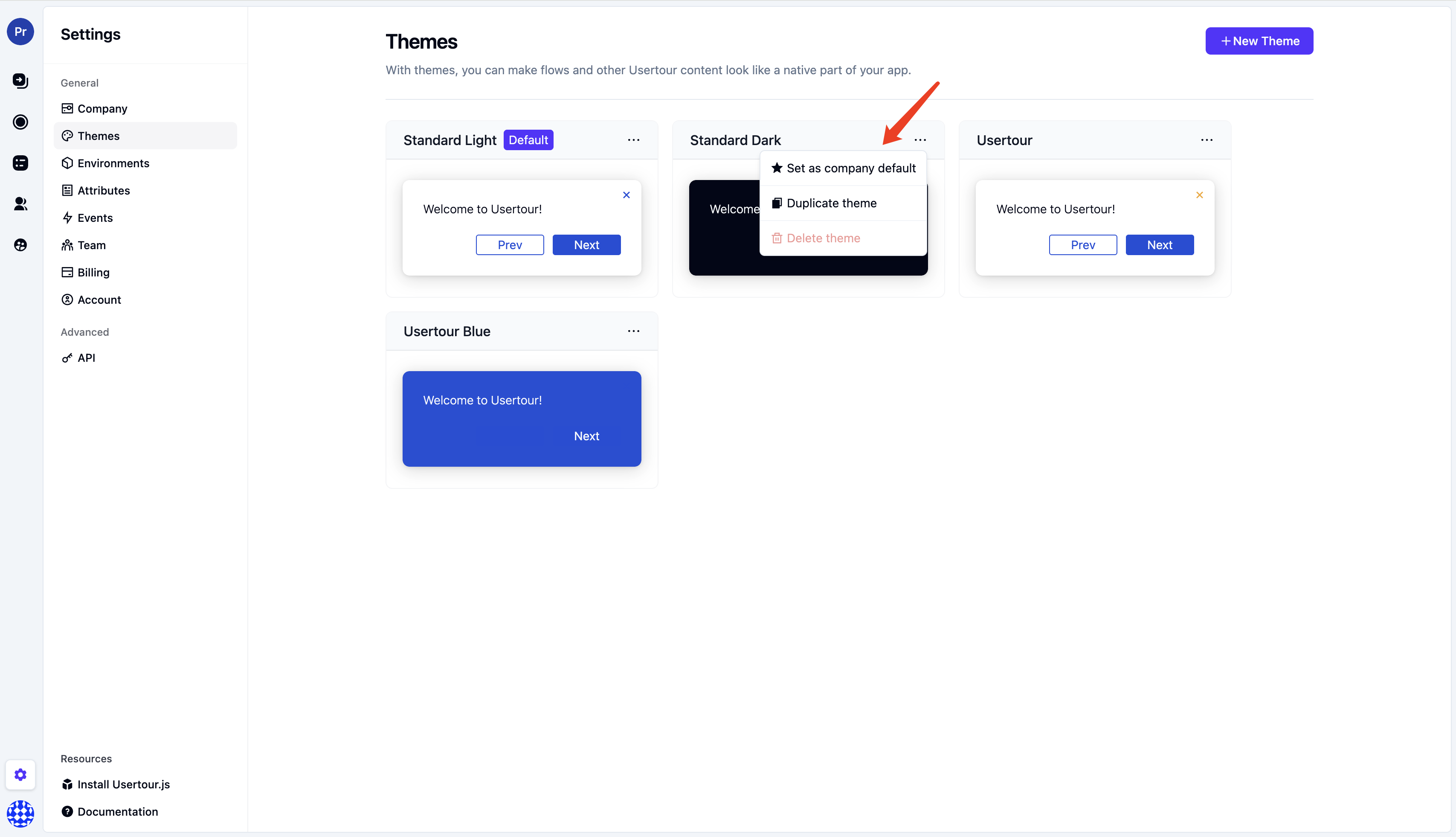
Applying themes to content
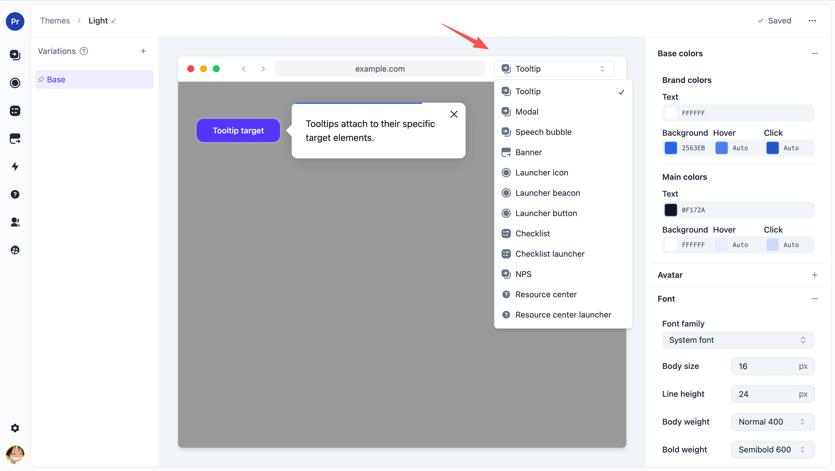
You can change the theme for flows, checklists, and launchers via the Theme button in the builder.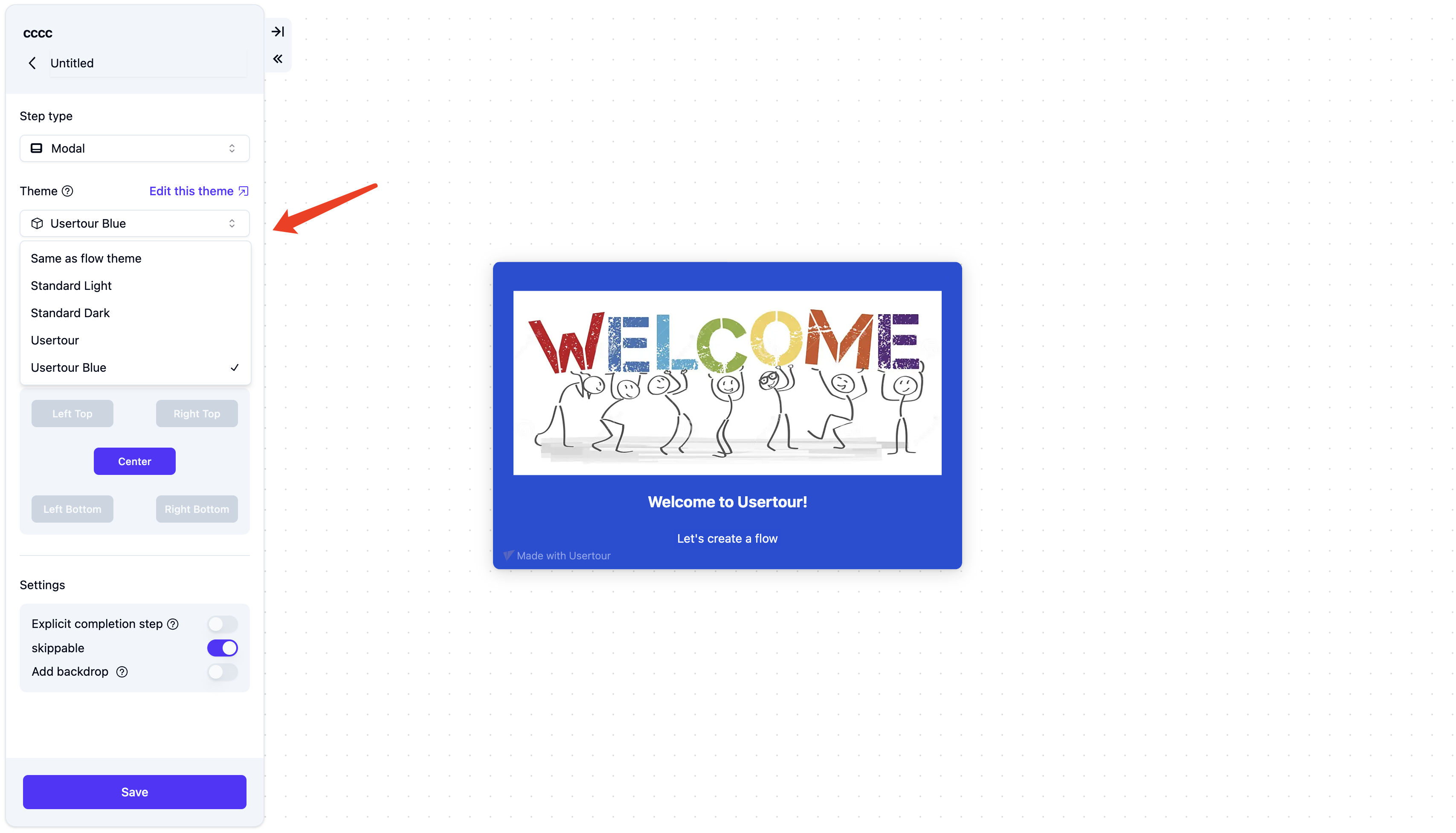
Theme Settings
- Base colors — Set the main colors for headers, buttons, background, and text across all content (speech bubbles, tooltips, modals, launchers, etc.). More specific theme options can still override these.
- Font — Set font color, family, size, line height, and weight for text.
- Chrome border radius — Control how rounded the corners are on modals, tooltips, and speech bubbles.
- X-button — Change the close (X) button color and behavior for flows and checklists: show an exit menu (resume, close, restart) or simply close the flow.
- Avatar type — Choose what appears on modals and speech bubbles: a cartoon character, your own image (upload or URL), or no avatar.
- Buttons — Customize buttons inside modals, tooltips, and speech bubbles—height, width, corner roundness, colors (default, on click, on hover), and alignment (left, right, center). Primary and secondary buttons can use different settings.
- Speech bubble — Set the width and position of speech bubbles (e.g. bottom left, top center). You can also adjust the offset.
- Tooltip — Adjust tooltip width and notch size. Set how long to wait when the target is missing and what happens then (auto-dismiss, show warning, or switch to speech bubble).
- Modal — Change modal width and padding (position is fixed). Choose whether the backdrop blocks clicks or closes the flow when clicked.
- Checklist — Set checklist colors, width, z-index, and position (e.g. bottom center, top right). Choose how completed tasks look: line-through or no decoration.
- Checklist launcher — Set colors (default, on click, on hover), width, z-index, and position for the checklist launcher.
- Resource Center — Configure the help‑hub panel: placement and offset (which corner, distance from edges), normal and large widths, max height, z-index, and open/close transition duration. Customize the home header: choose between solid color, gradient, image, or none, and upload a logo to overlay it.
- Resource Center launcher — Style the launcher button users click to open the Resource Center: icon type (default question mark, plain text, or your own image), height and image height, border radius (set to round for a circular button), and whether to show the launcher text label. Pick colors for the default, hover, and active states, plus the icon/text foreground color.
- Progress bar — The bar that shows progress through flow steps. Pick a style and set its color, height, and position (top or bottom).
- Beacons — Set the beacon color for flows and launchers.
- Launcher icons — Set icon size, colors, and opacity for launcher icons.
- Launcher buttons — Set launcher button colors (default, on click, on hover), height, width, border radius, and border size.
- Backdrop — The dimmed overlay that blocks clicks and highlights the modal or tooltip. Customize its color, opacity, and the highlight (type, radius, spread, color, opacity).
- Focus highlight — The outline on focused buttons for accessibility. Set its color and opacity.