What is the Resource Center?
The Resource Center is a persistent, in‑app help hub that lives behind a launcher button in the corner of your app. Users open it to find onboarding flows, documentation, or reach out for support — all without leaving your product. It is built from tabs at the top level, with each tab containing one or more blocks that drive the actual interaction. Use the Resource Center when you want a single, always‑available entry point for help, instead of (or alongside) one‑off launchers and checklists.
Creating a Resource Center
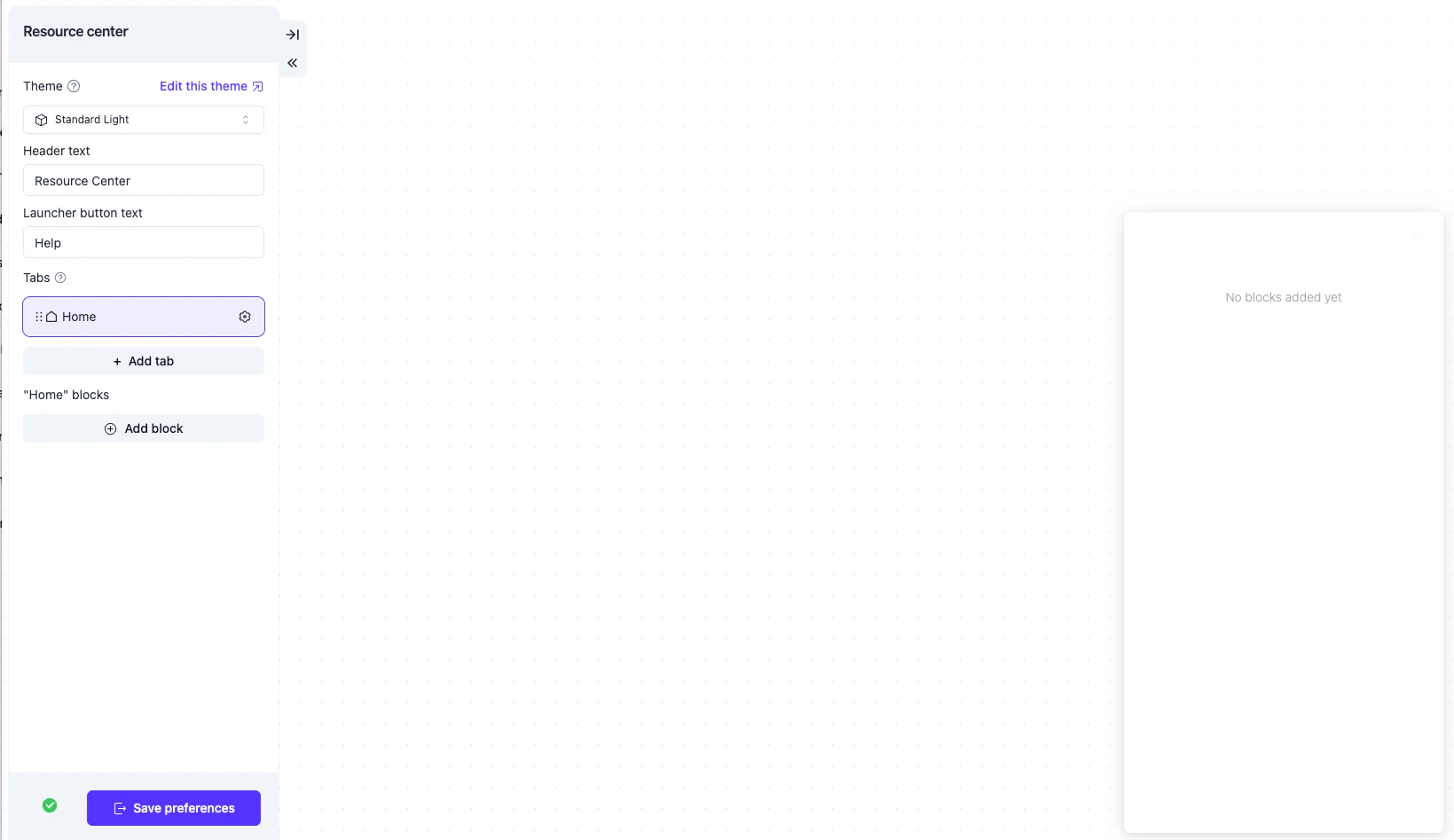
Basic Setup
- Head over to Usertour and sign in
- Click Resource Center in the sidebar
- Click Create resource center, give it a name, and confirm
- Configure tabs and blocks (see below)
- Set its auto‑start conditions on the resource center detail page
- Publish the resource center
Make sure Usertour.js is installed in your app. Without it the launcher will not show up for your users.
Tabs
Tabs are the top‑level grouping inside the Resource Center. A typical setup might look like:- Get started — onboarding flows
- Help — documentation links and FAQs
- Contact — live chat or a contact form
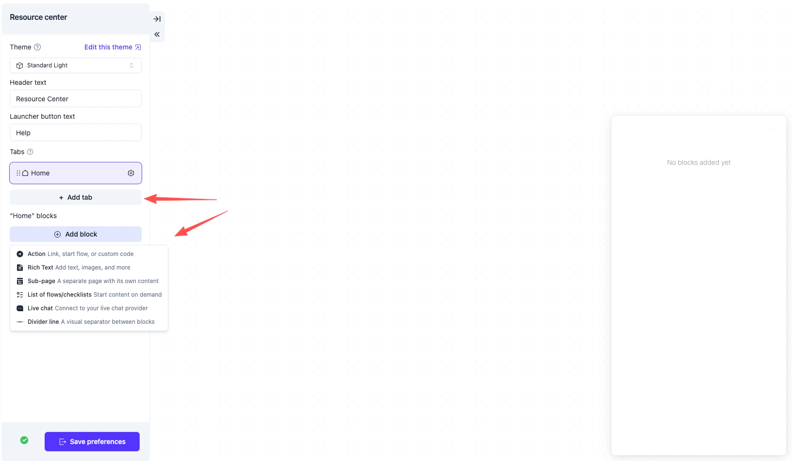
Blocks
Inside each tab you place blocks. There are six block types, falling into two categories: clickable CTAs and display‑only content.
Each block has an optional visibility condition so different users (e.g. by attribute, role, or completion state) see a different set of blocks.
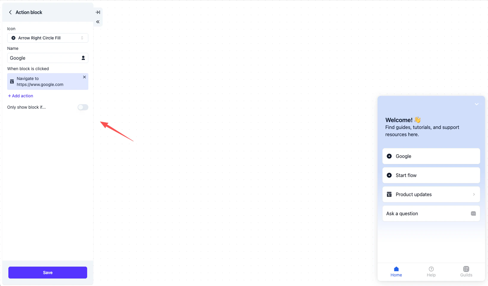
Click semantics
The four interactive block types behave consistently when clicked:- Action, Live Chat (custom code), and items inside Content List all collapse the resource center back to the launcher after firing — the same effect as the user clicking the close button.
- Sub‑page and Content List blocks navigate inside the panel without collapsing it, so the user can browse further.
User Experience
Launcher and panel
The Resource Center renders as a small launcher button in the corner of your app. Clicking the launcher expands the panel; clicking the close button collapses it back. The expanded/collapsed state is remembered for the rest of the user’s session.
Navigating sub‑pages and lists
When a user clicks a Sub‑page or Content List block, the panel slides into a detail view with a back arrow in the header. Their navigation state (active tab + current sub‑page) is persisted across page refreshes within the session, so they pick up where they left off.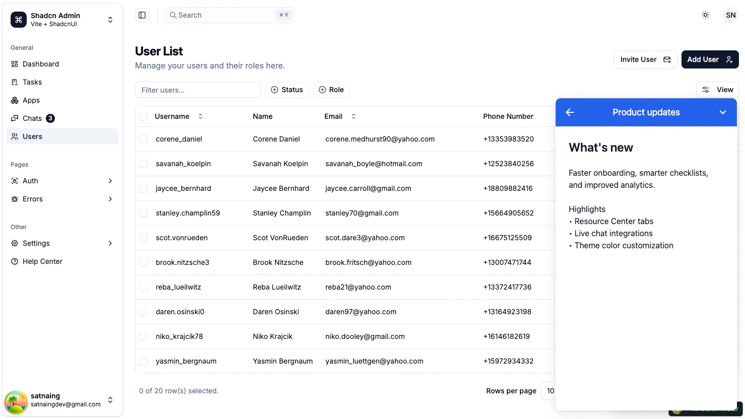
Content List
A Content List block surfaces a curated set of flows and checklists. Each item shows its name and icon; clicking an item launches that content immediately and collapses the resource center back to the launcher.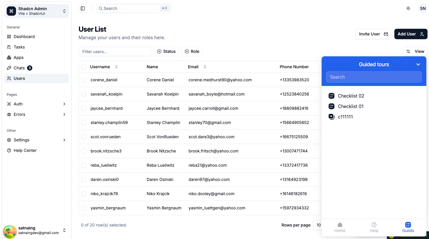
Customization
Appearance
Customize the Resource Center through the theme editor:- Open Settings → Themes
- Pick a theme and scroll to the Resource Center section
- Adjust panel width, header background, launcher size and color, fonts, and corner radius
- Save and the changes apply across all resource centers using that theme
Position
The launcher’s corner placement and offset are configured per resource center on the detail page. Common choices are bottom‑right (default) or bottom‑left.Visibility control
You can hide the launcher temporarily — for example, on a focused checkout page — without disabling the resource center entirely. Use thehideResourceCenterLauncher() and showResourceCenterLauncher() methods from Usertour.js.
The panel itself can also be opened or closed programmatically — see Programmatic control below.
Programmatic control
Usertour.js exposes a small API for the Resource Center so you can integrate it with your own UI:openResourceCenter()— expand the panelcloseResourceCenter()— collapse to launchertoggleResourceCenter()— flip between the twoisResourceCenterOpen()— read the current stateshowResourceCenterLauncher()/hideResourceCenterLauncher()— control the launcher button
toggleResourceCenter(), so users have two equivalent ways to open the panel.
Best Practices
- Keep tabs few and meaningful — three to four tabs covers most use cases. Long tab strips push content off‑screen and make the panel feel cluttered.
- Group by intent, not by feature area — “Get started”, “Learn”, “Contact” reflect what users are trying to do. Mirroring your engineering modules rarely does.
- Use Content List for flows and checklists — keep launchable content in one curated list instead of duplicating each one as a separate Action block.
- Reserve Action blocks for true CTAs — buttons that fire and dismiss the panel (“Schedule a demo”, “Open changelog”). For navigation that should keep the panel open, prefer Sub‑page.
- Hide the launcher in distraction‑free flows — checkouts, onboarding overlays, focused editors. Re‑show it when the user returns to the main app surface.
- Test visibility conditions per role — preview the resource center as different user types to verify the right tabs and blocks appear for each.