Looking to put a video, a form or another web page inside a flow step? That is the Embed
content block — see Embed any content. This page is about the Embeds
content type: cards that live in your app’s layout.
What is an embed?
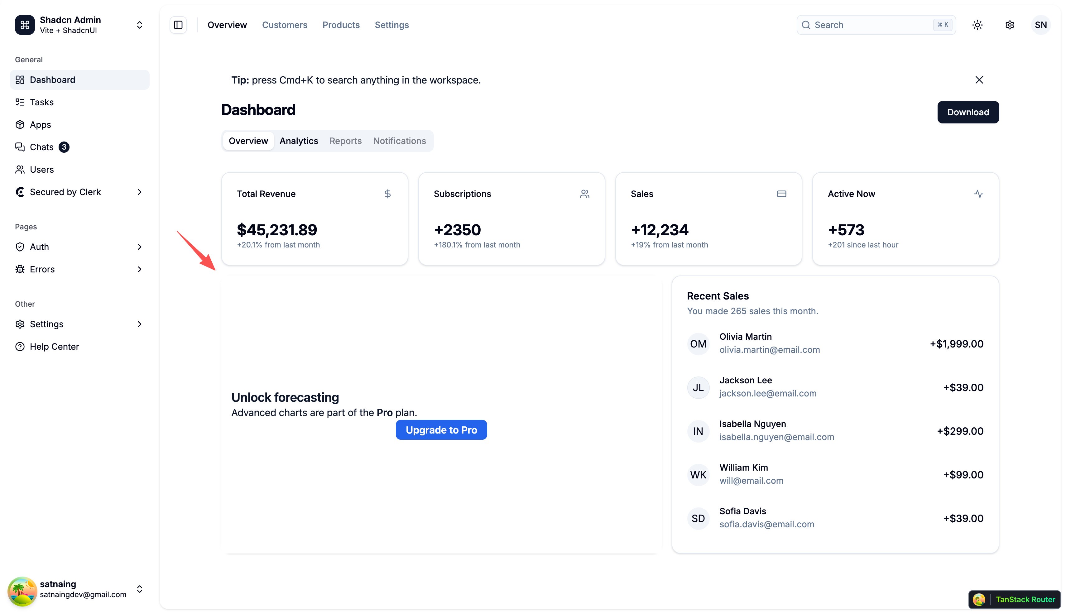
An embed is a card that lives inside your app’s page, at an element you choose. It is not a popup and it does not float over the page: it sits in the layout, next to or inside your own components, and the page flows around it. You can use embeds to:- Upsell and gate features — Cover a locked chart or report with an “Upgrade to Pro” card
- Announce in context — Put a “what’s new” card right in the area the feature lives
- Fill empty states — Show a getting-started card where the list is still empty
- Ask in place — Run a short inline survey where the answer is on the user’s mind
- Run campaigns — Promote a webinar or an offer in a dashboard sidebar
Creating an embed
-
Click Embeds in the left sidebar
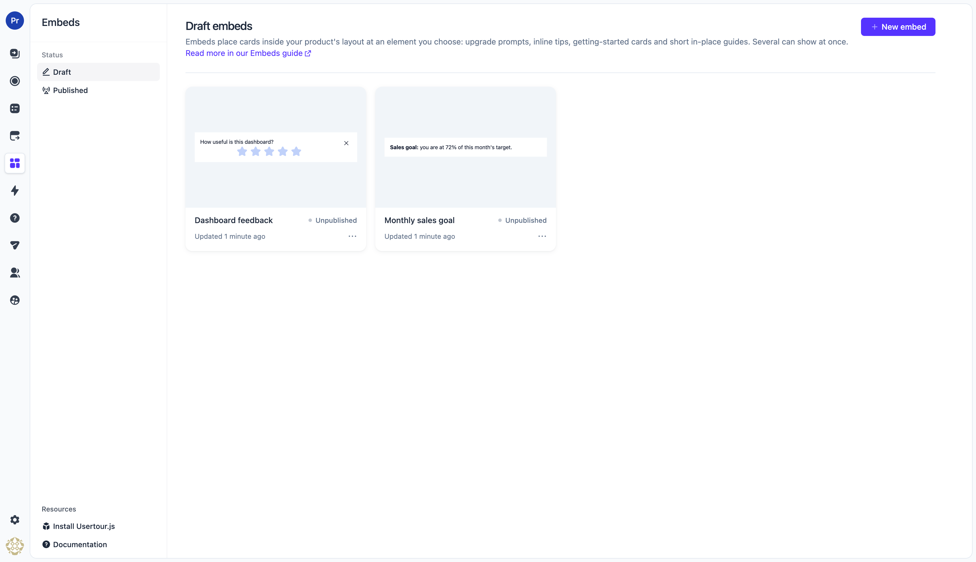
- Click Create embed
-
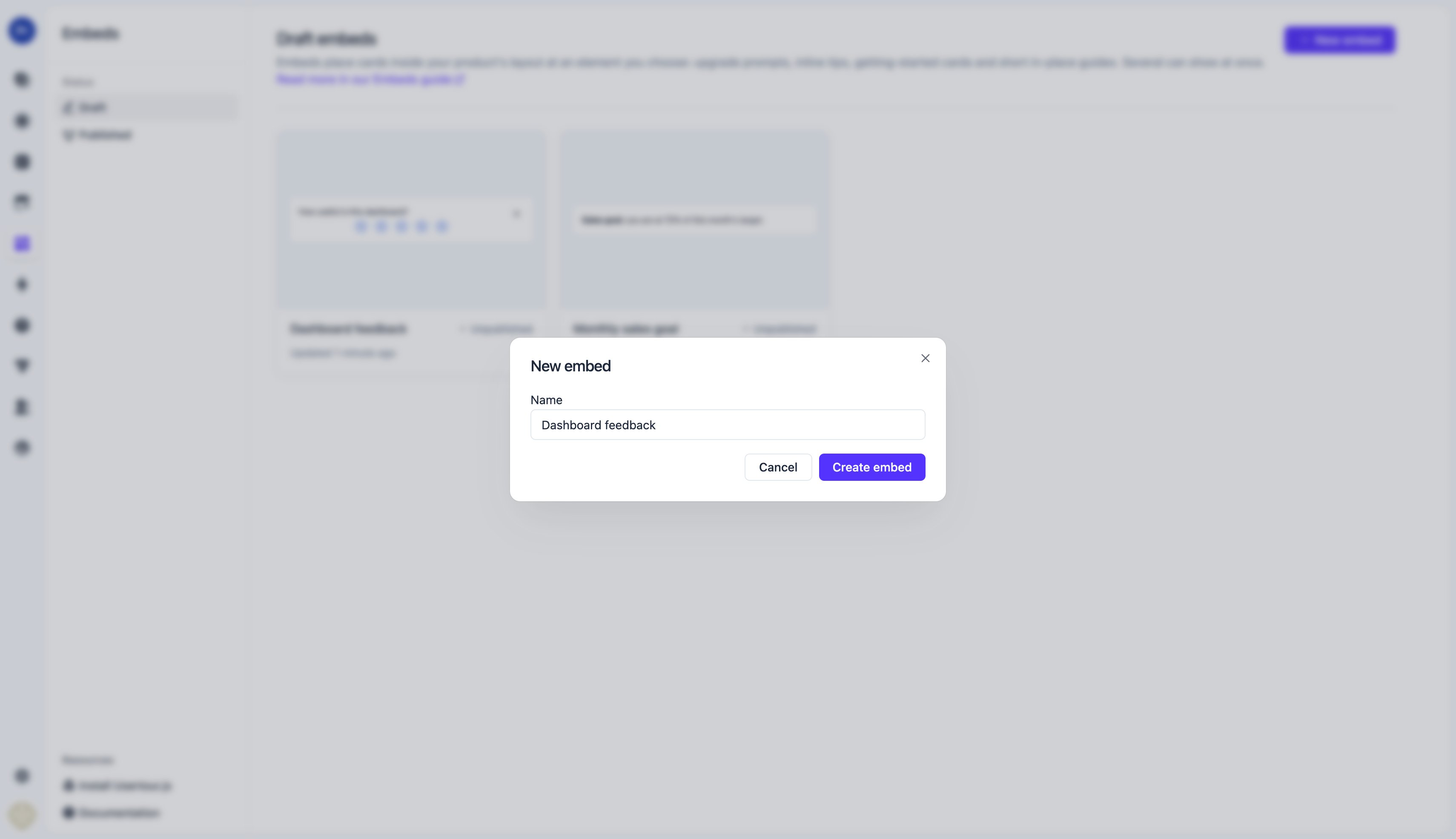
Enter a name for your embed and click Submit
-
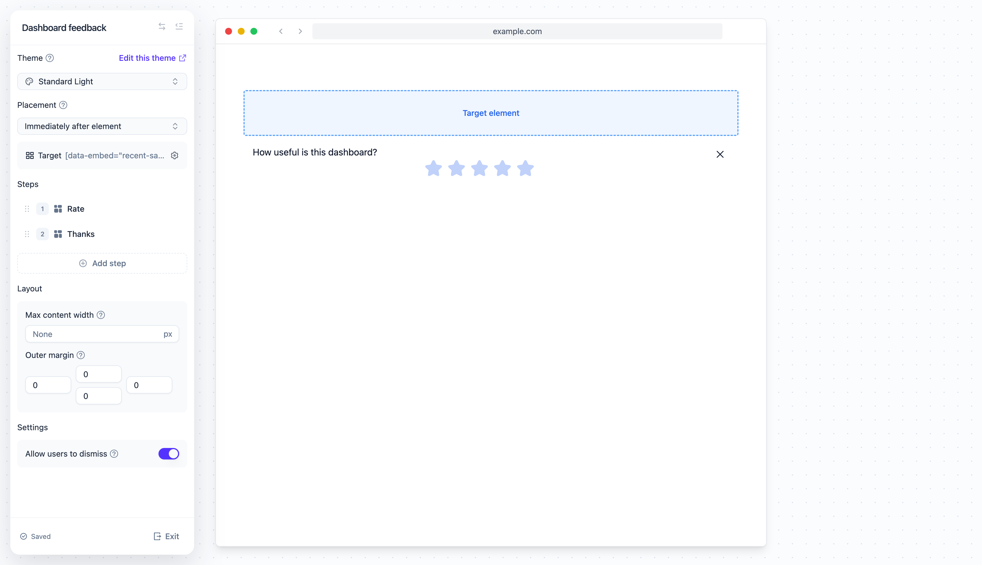
The editor opens with the preview on the right and the settings panel on the left
Choosing where it shows
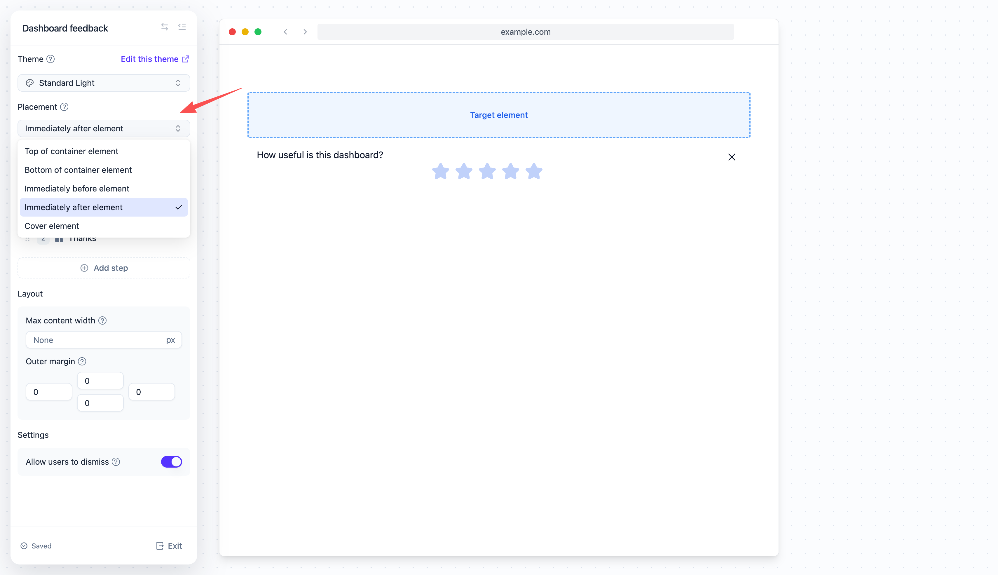
Every embed is placed relative to one element of your page: its target. Pick the placement first, then point the embed at the element.Placement
- Top of container element — Inside the element, as its first child
- Bottom of container element — Inside the element, as its last child
- Immediately before element — As a sibling, right above the element
- Immediately after element — As a sibling, right below the element
- Cover element — Over the element, sized to it. The element stays in the page underneath
position of
its own, the SDK gives it position: relative while the cover shows. An element that cannot hold a
child (an image, a canvas, a form field, an iframe) or that scrolls its own content gets the card laid
over it from outside instead, so the card stays over the element rather than scrolling with its
content. Either way, the element’s content is not touched.
Target element
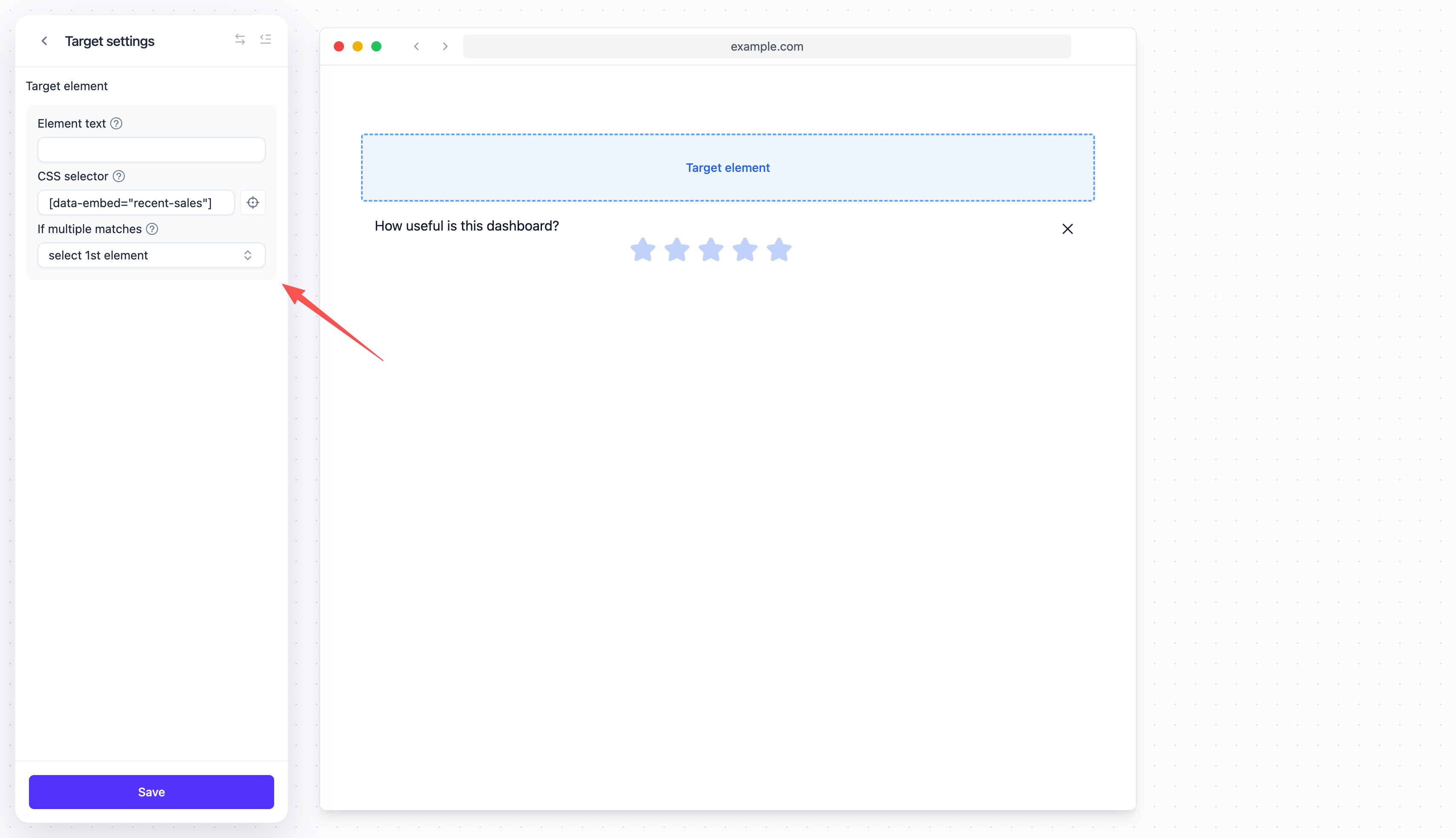
Click the Target row under the placement to open the target settings, and enter a CSS selector that matches exactly one element. If the element has no stable selector, add anid or a data-*
attribute to it in your app — see Selecting elements.
The selector is matched against your page itself, not inside iframes: like a banner, an embed is
inserted into the page, so an element that exists only inside a frame keeps the embed waiting. See
Iframes.
- Z-index — Stacking order of the cover above your page. Leave it empty for the default
- Content position (back in the Placement section) — Where the content sits inside the covered area: Top, Center or Bottom. The cover is as tall as the element it covers, so the content has room to move. Center is the default
Adding steps
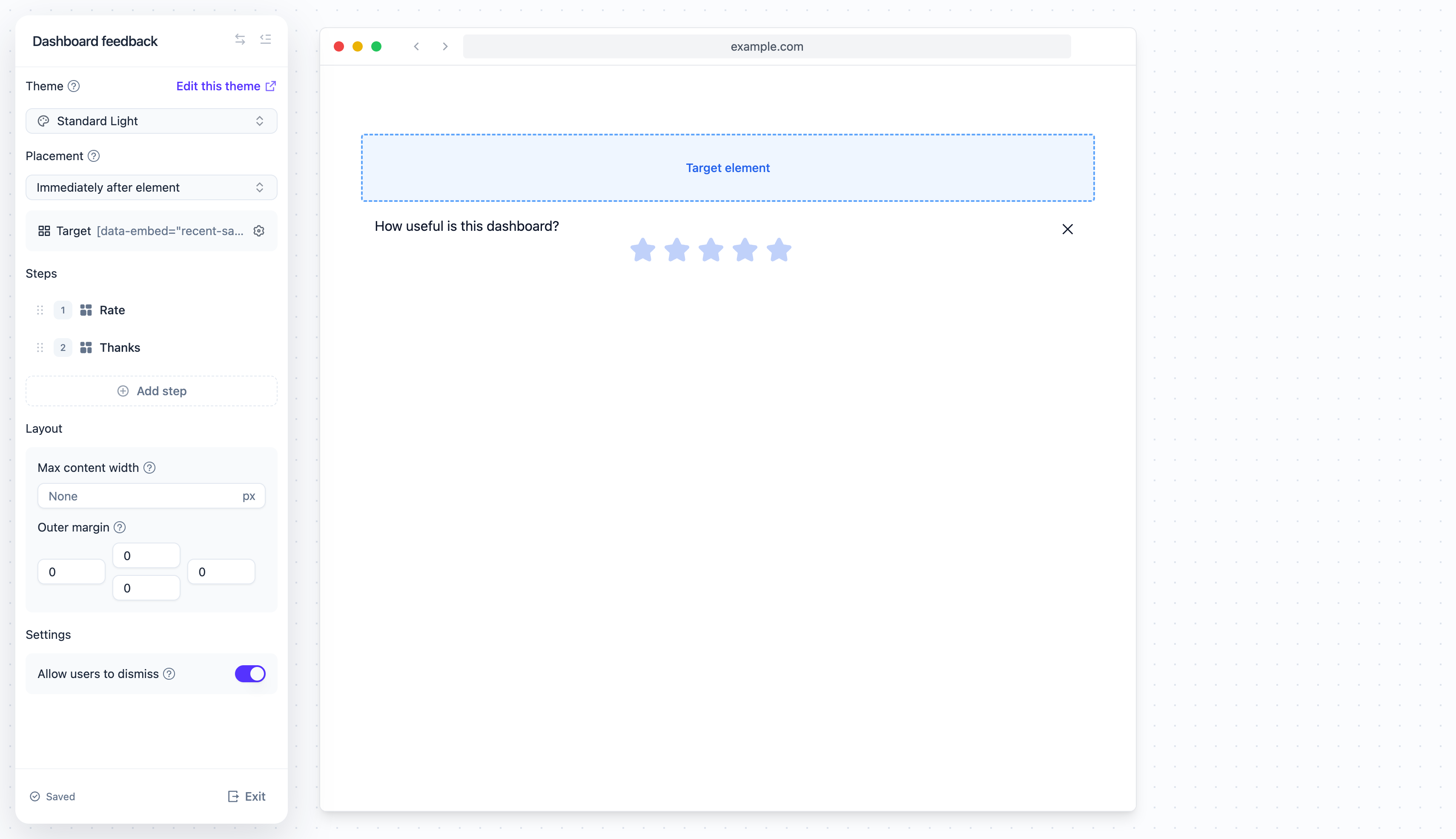
An embed’s content lives in steps, the same building blocks a flow uses. Most embeds have one step. Use more when you want the card to page through something in place: a two-screen “what’s new”, a question followed by a thank-you, a short guide.- In the Steps section, click Add step and pick a kind:
- Inline — A step the user sees, rendered inside the card
- Hidden — No UI; a step that only runs triggers, for routing between steps
- Click a step to edit its content in the preview on the right
- Type your text directly into the preview. Click the + button to add buttons, images, or a question — one question per step
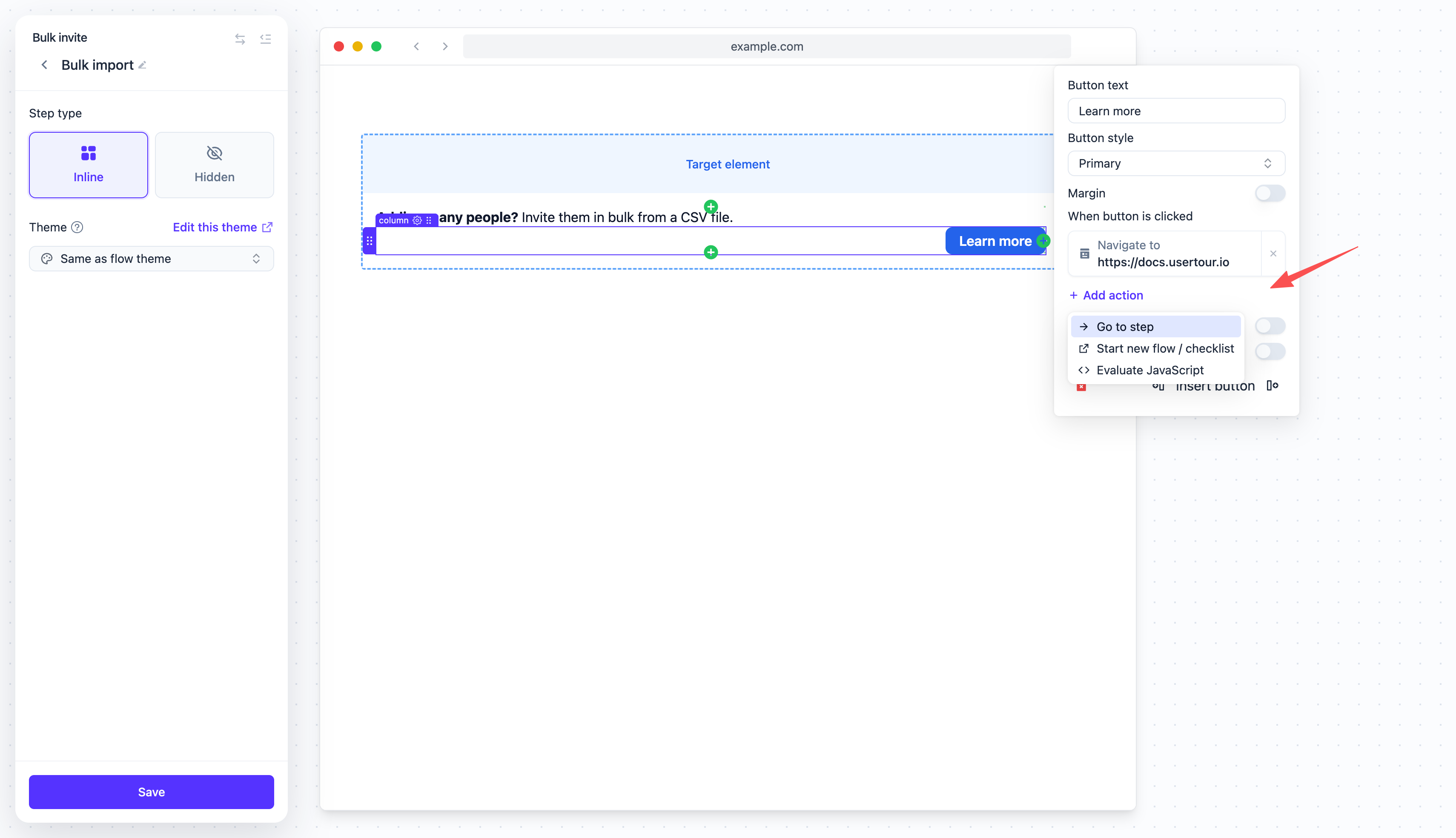
Button actions
When someone clicks a button, you can:- Go to step — Move to another step of this embed, by name
- Dismiss embed — Close the card
- Navigate to page — Send them somewhere specific
- Start new flow — Launch a flow or a checklist
- Evaluate JavaScript — Run your own custom code
Layout and settings
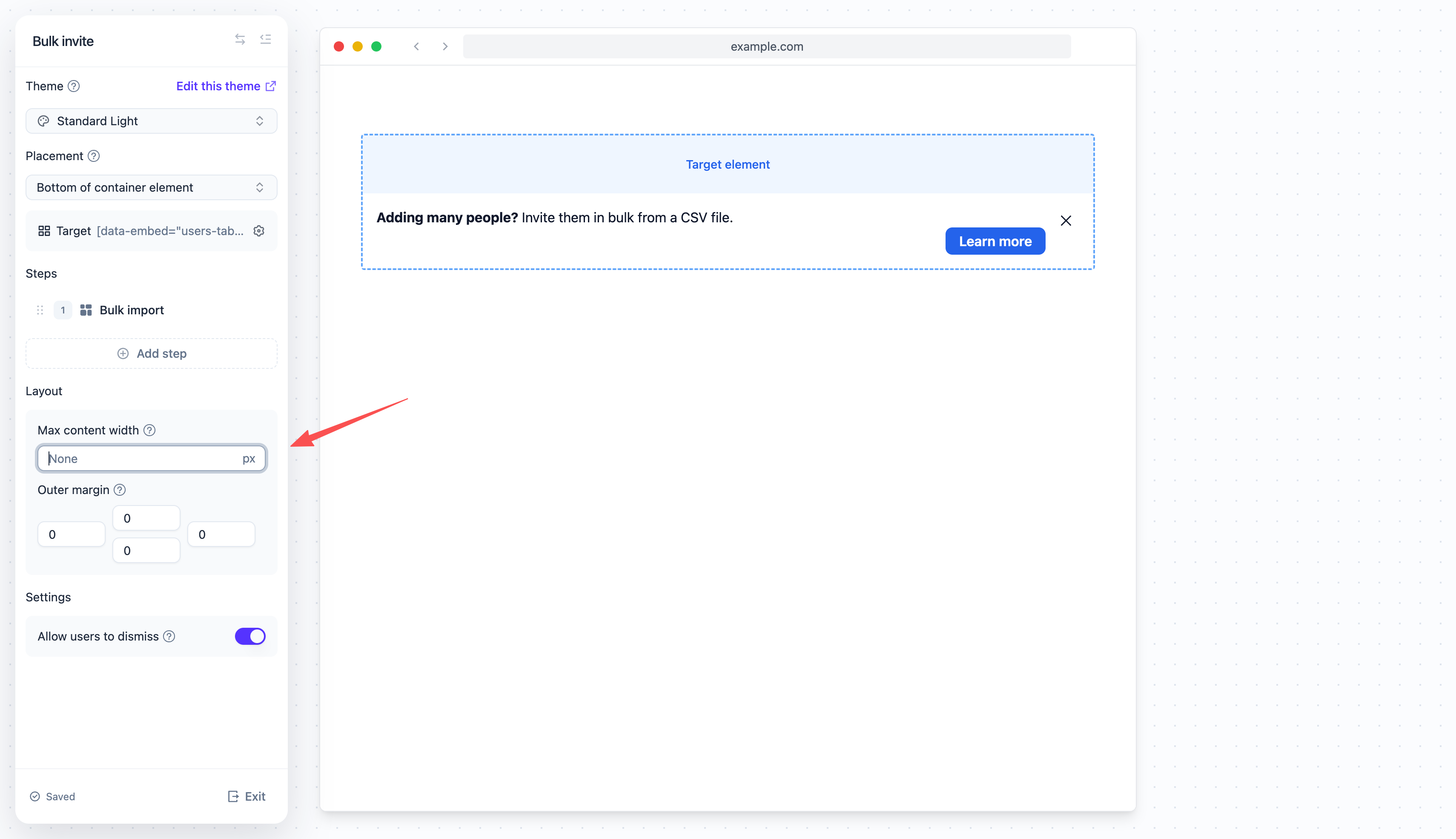
- Max content width — Caps the width of the content column, in pixels. Leave it empty to fill the embed
- Outer margin — Space between the embed and the surrounding content, on each side
- Allow users to dismiss — Shows a close button in the card’s top-right corner. Dismissing ends the current session; whether the embed shows again is decided by its frequency, below
- Animate on appear — Reveals the card with an animation instead of just popping into place: an in-flow embed expands to its height while fading in, a cover fades in over its element. It plays once each time the embed appears, not on a step change, and not for users who ask their system for reduced motion. Off by default, so the card looks like part of your page
Deciding who sees it
Back on the embed’s page, open Settings and set the rules under Show embed if…. These work like start rules do elsewhere — see How start rules work — with one difference worth knowing: The rules are checked continuously, not just once. The embed is visible while the user matches them and the target element exists, and it disappears the moment either stops being true. A user on the free plan sees the upgrade card; the moment the plan changes, the card is gone, with no dismiss and no reload. If the user qualifies again later, the card comes back on the step it was on. When you publish a new version, a user’s card stays on the step it was on; if that step was removed, it starts again from the first step. There are no separate hide rules. “Show if A, hide if B” is simply “show if A and not B”.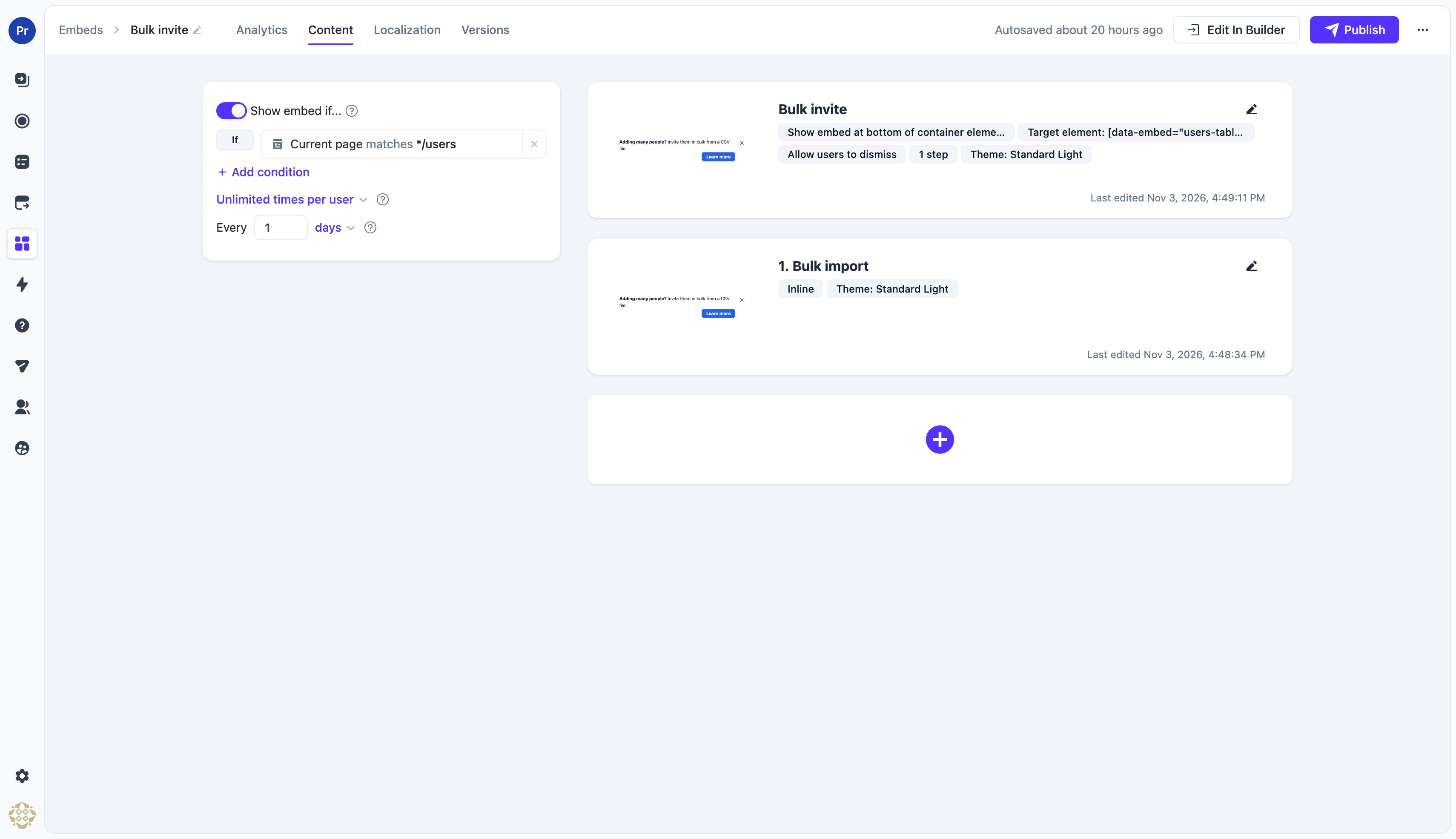
Frequency
The frequency setting decides what happens after the user dismisses the embed:- Once per user — Dismissing is final; the embed never shows again for that user
- Unlimited times per user — The embed may come back once the gap you set has passed since the dismissal, as long as the rules still match. One day is the default
- Multiple times per user — The same gap, plus a cap on the total number of times the embed may show for that user
Several embeds at once
Every embed whose rules match shows at the same time, each at its own element. Several embeds can even share one element: they stack in the order they were delivered. There is no priority between embeds and nothing to arbitrate — if you want one card instead of two, give them rules that do not overlap.Styling embeds
Embeds take their look from the theme. In the theme editor, the Embed section sets the card’s Background color and Text color; the default background follows the theme’s main color, so the card looks like part of your page rather than a brand-colored banner. Animation duration and Animation style set how the card is revealed for embeds with Animate on appear turned on. Padding and borders come from the shared settings of the theme.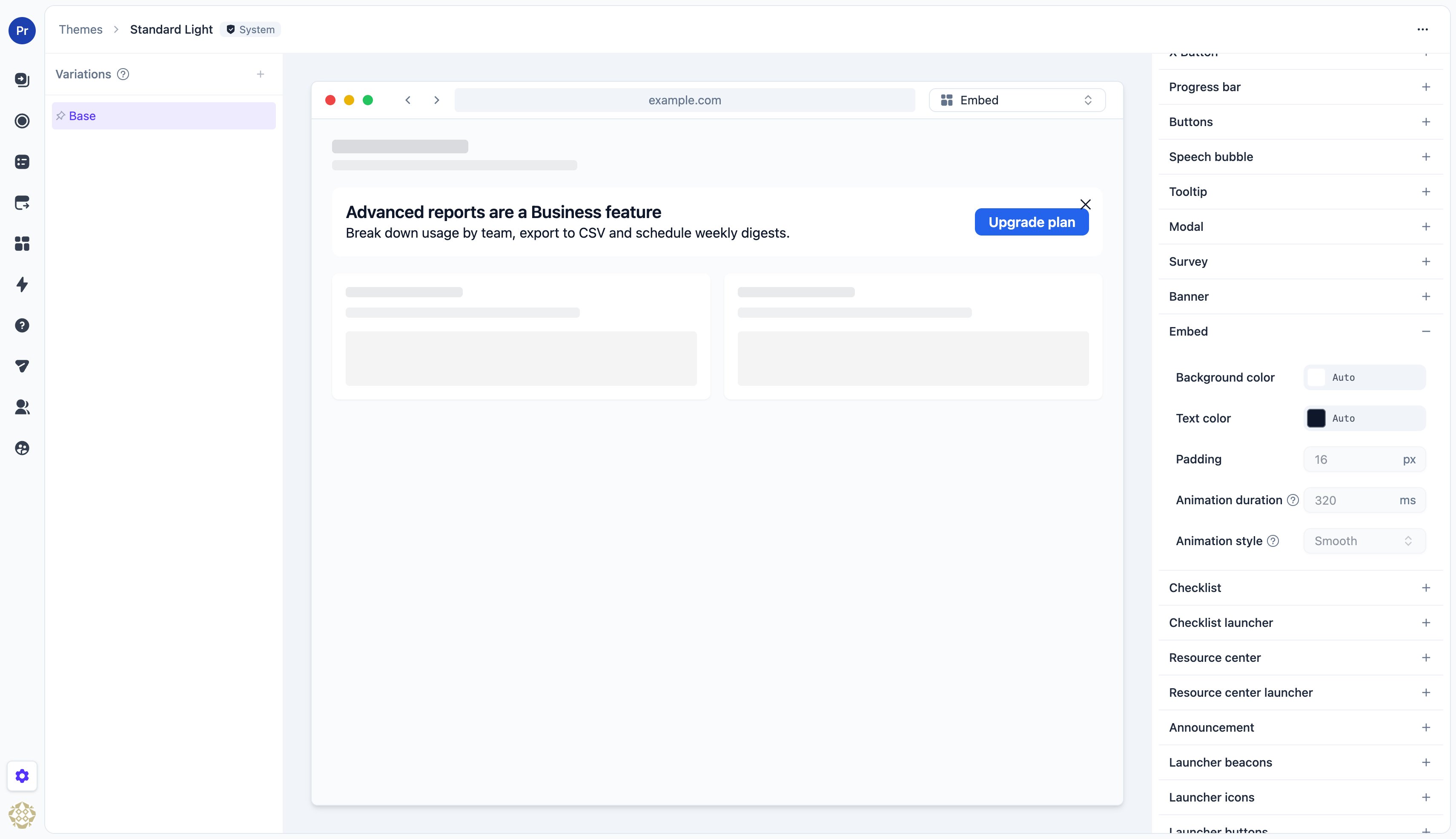
Measuring embeds
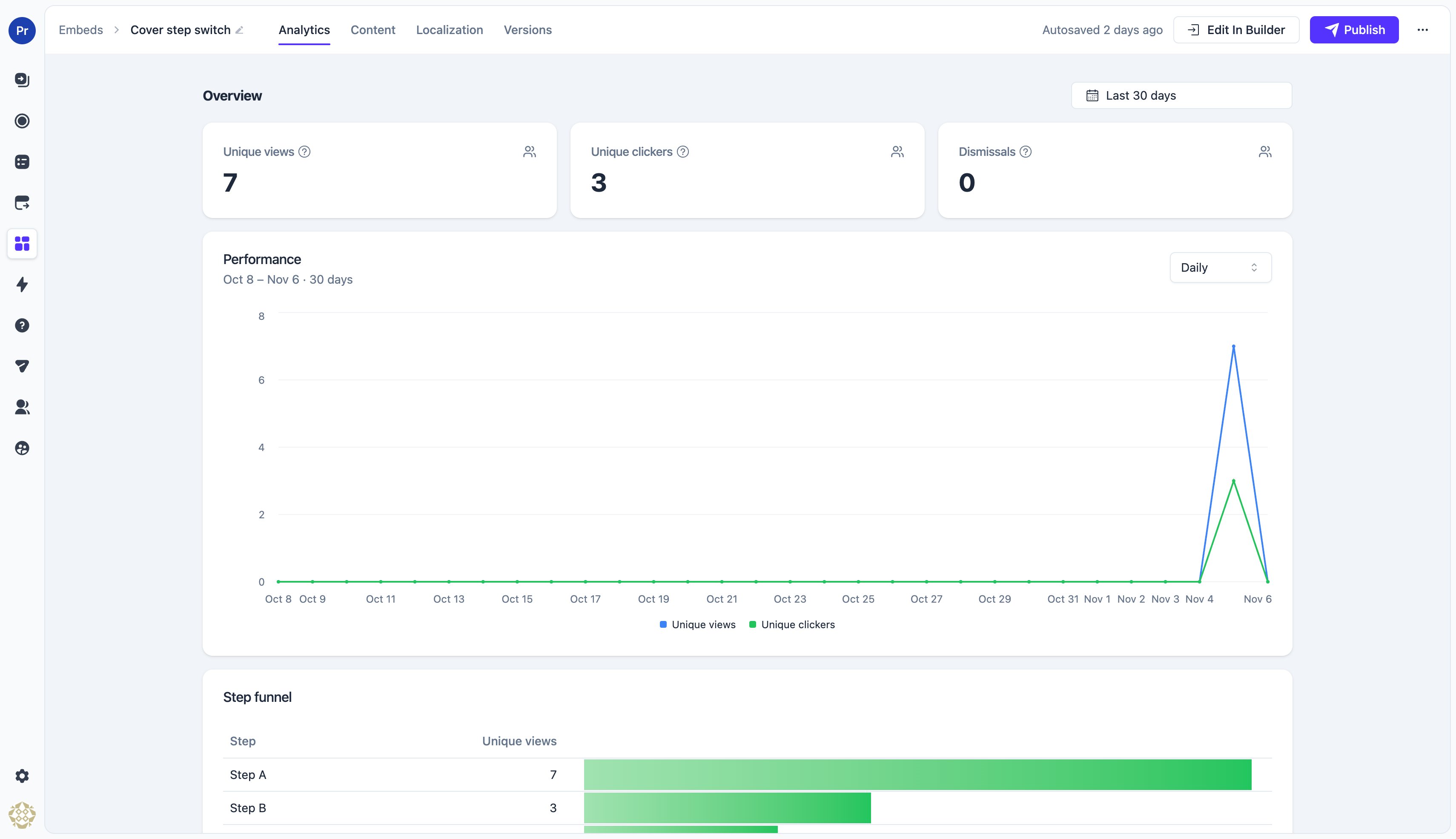
The embed’s Analytics tab shows:- Unique views — People the embed started showing for in the selected date range. Someone it comes back to after being dismissed counts again when it comes back
- Unique clickers — People who pressed any button in the selected date range
- Dismissals — People whose embed ended in the selected date range: they closed it, or it was unpublished or ended for them